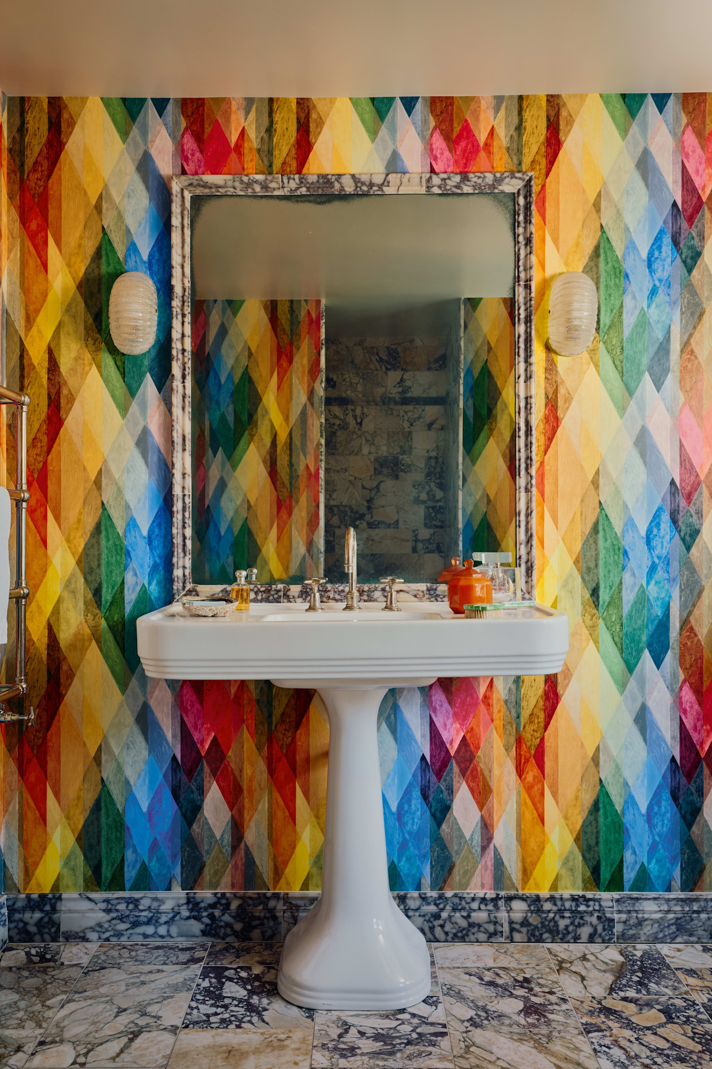
“Flocking Fridays” were a feature of life at the hand-block printing business launched by John Perry in an Islington wallpaper mill in 1875. Yelena Ford, the new managing director of Cole & Son (today’s evolved version of his company), may not exactly be bringing back this celebration of the 17th-century Dutch process of imitating cut velvet, but she’s channelling its youthful, main-character energy.
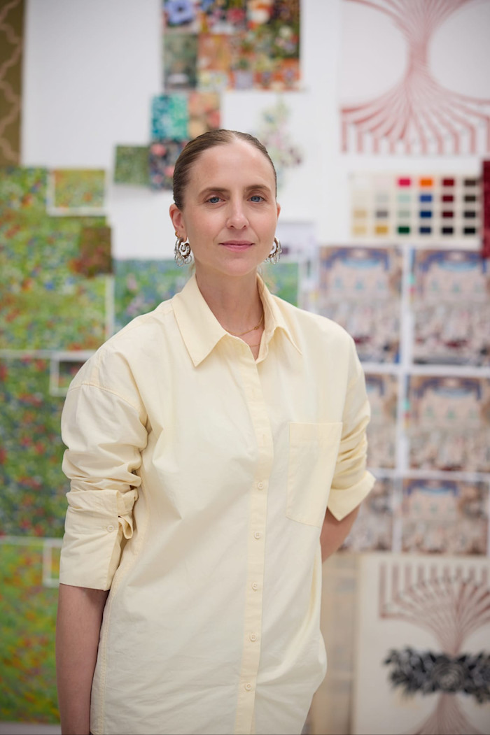
“You can live with wallpaper in so many ways,” she says. “I want it to be an intervention in someone’s home that brings value beyond its colour and pattern, but also in the value of its storytelling, craftsmanship and history which then, within that space, helps people to create their own stories.”
Having previously worked as managing director at rarefied retailer The New Craftsmen, Ford spent a lot of time thinking about the idea of what creates “atmosphere”, she says. “That’s what wallpaper can do; it brings other layers — in terms of acoustics, texture, warmth and depth — which really hold a space together.”
Under Perry, the company was always innovative, not only reviving the art of flocking, but pioneering finishes such as a shimmering replication of moiré silk. Over subsequent centuries, the company created papers for the Houses of Parliament, Buckingham Palace, Windsor Castle and Chatsworth House. More recently, Cole & Son has become famous for its archive prints, the 18th-century Hummingbirds and the late 1950s Woods, and for collaborations such as the dreamy, monochromatic Nuvolette cloudscape with Fornasetti.
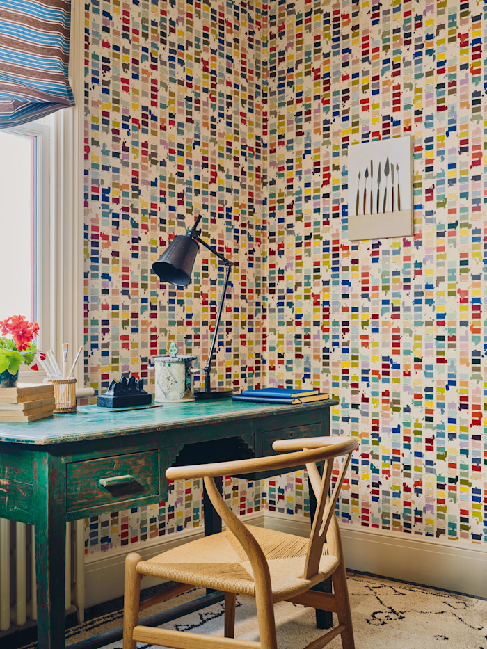
The geometric patterns in the new Formations collection, the first under Ford’s directorship, largely riff on these heritage techniques, bringing “a freshness and sharpness” through the graphic lines, grids and angles of the 11 new designs, “softened with our hand-drawn and painted, craft-led processes”, says Ford.
“Scumbling”, a traditional decorative paint technique using translucent glazes and expressive brushwork to mimic the effect of faux marble, features in Archival Marble, inspired by Cole & Son’s archive marble books and “a little instruction note found in one of them advising how to hang it in horizontal blocks”, says Ford. “We were like, ‘oh, hang on, we could use that idea from yesteryear to structure our thinking for how this could live in a space now’.”
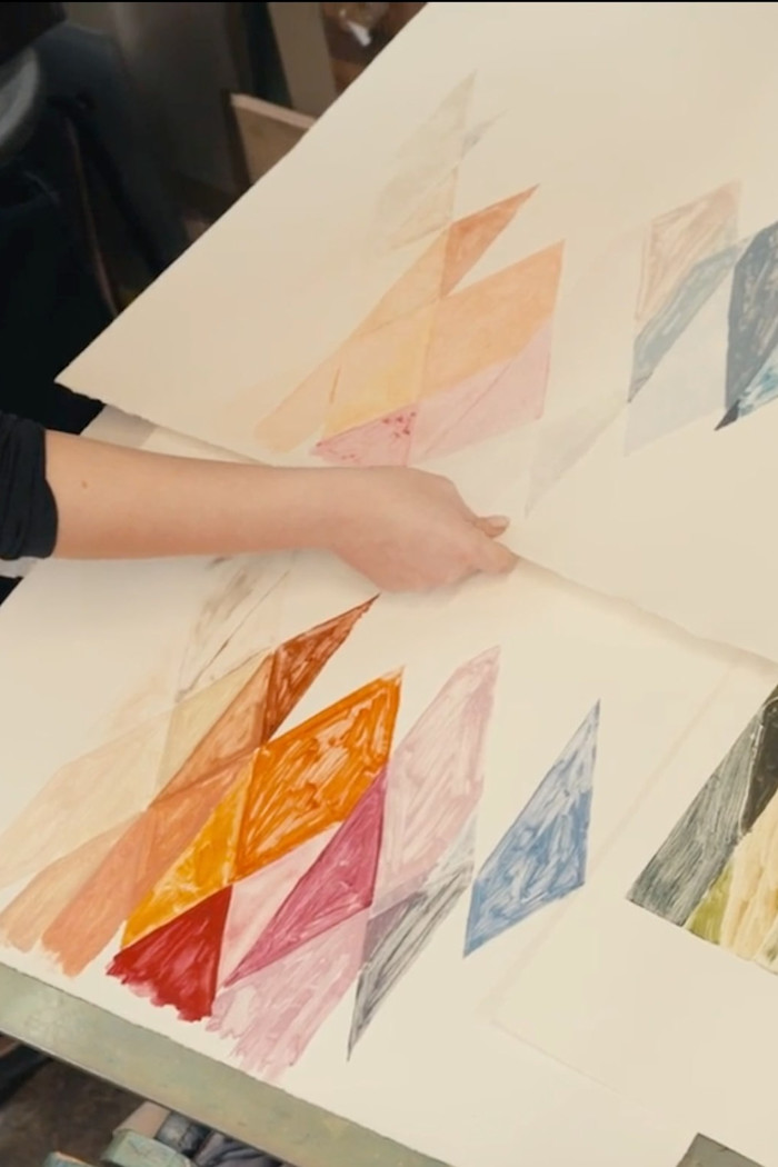
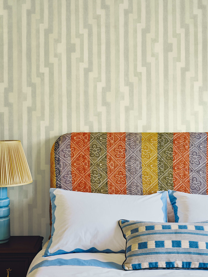
Aquatinting — the process of etching on to a copper plate and exposing it to acid to affect the gradation of colour — was used for the slightly fuzzy, quilted effect of Diamond Maze. Wavelet draws on the zigzag geometry of historic Bargello needlework embroidery. Scattered Ink is “an interplay of precision and spontaneity” where the exact, gravure-etched outlines are interjected with freehand-painted ink splodges. Fretwork, inspired by the century-old Cole & Son original Frette, benefits from an analogue print method: ink is layered upon ink to create a tactile imprint which intimates a honeycomb effect.
Ford argues that pattern shouldn’t be something that gets applied to a room at the end, but rather “it should be part of the architectural conversation right at the beginning, working in dialogue with the furniture, textiles, art, light and materiality in a space”.
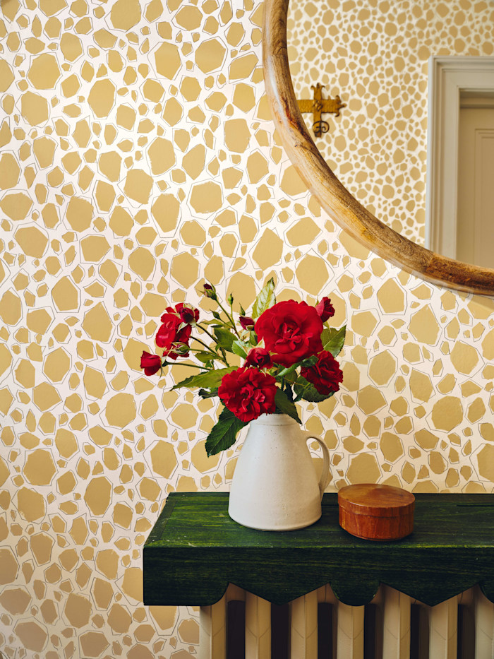
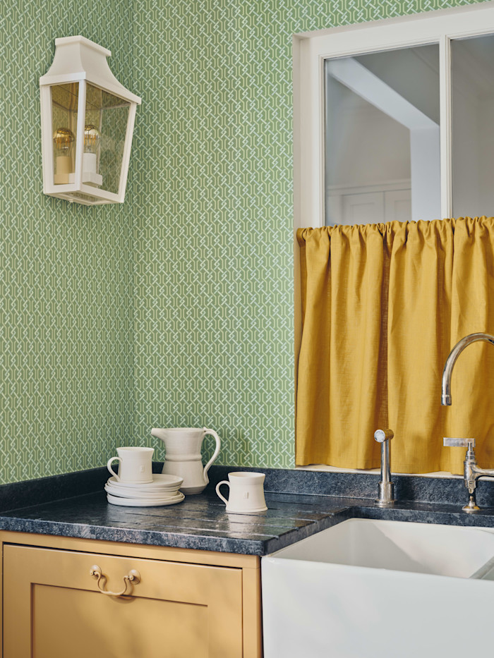
“A lot of people, me included, hang art on plain walls,” she adds. “But pattern can act in dialogue with other things in a room; it doesn’t always have to be the loudest thing.” Campaign imagery, created with Georgia Spray, founder of art platform Partnership Edition, shows “pieces of art in conversation with the wallpaper, not just in terms of palette but also in the processes that went into making it. I wanted to show how the art lives layered on top of the paper.”
Ensuring Cole & Son remains meaningful for another 150 years is Ford’s biggest challenge. “I want Cole & Son to be the leading authority on living with pattern. We have an extraordinary creative history, but I don’t want us to become a museum of ourselves. I want us to take everything we know about pattern, colour and craft and ask what it can mean for the way people live now.”
The new Formations collection is available to order, from £150-350 per metre; cole-and-son.com
Find out about our latest stories first — follow @ft_houseandhome on Instagram